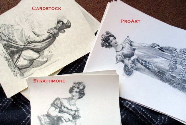
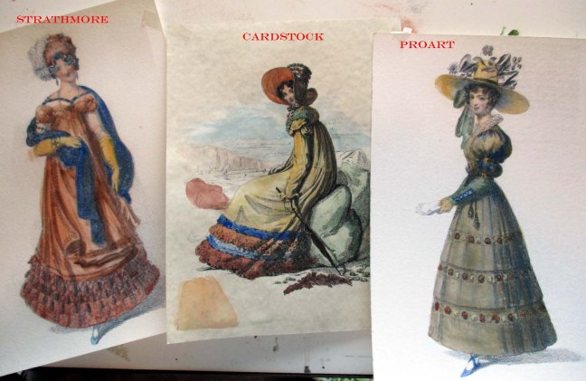
Comparing papers

win2 copy

Comparison:
Cream-colored cardstock of some sort
ProArt 140lb cold press watercolor paper
Strathmore 140lb cold press watercolor paper
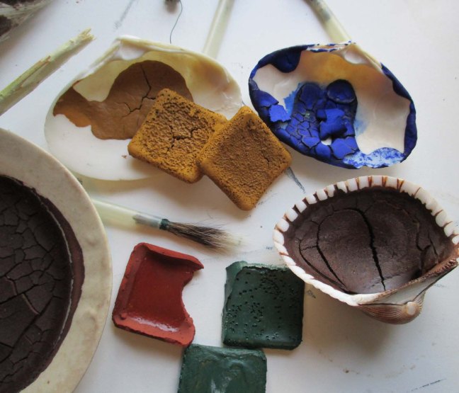
3 different brushes- squirrel fur with turkey ferrule.

I think I printed the cardstock on the office printer- it worked but wasn’t especially happy about it. I painted with a squirrel brush that I’d trimmed the tip off of, so it covered more ground but was rather stubby and didn’t do corners well. The watercolors appear brighter on this paper. It didn’t wrinkle as badly as I’d expected. The toner repels water, though, so where the ink is thicker I had to smooth in beads of water with a finger. Since it is not meant for watercolor, it might be harder to remove unwanted color and the surface of the paper might not withstand scrubbing or repeated washes.

win3

The ProArt paper had the same problem with the watercolor being repelled by the toner. I used a long squirrel brush for this one that was a little difficult to control. The paper is not just thick, but stiff; it didn’t wrinkle at all. It doesn’t absorb color quickly so it is easy to pick up unwanted color with a brush.

The Strathmore paper is not as bright a white as ProArt, which is fine with me. The employee printed it in color for some reason, a dark blue-black. It didn’t repel the water, but tended to dissolve, unfortunately. See her elbow. So long as I specify black, it shouldn’t be a problem in the future. The Strathmore paper feels thinner than the ProArt even though they are the same weight, probably because it doesn’t have that starched feel. The third brush didn’t give me any trouble, or perhaps I was getting used to them.

The greens had trouble wetting, but didn’t want to rub out, either. I also need to add a pink and/or a crimson to my colors. It’s hard to put roses in the cheeks and I can’t mix a good skin tone with just yellow and red ochre and white.

The technique with early watercolor was to lay in shadows with ink washes and tint the picture with light color washes. Since the toner is repelling water I’m going to have to give this more thought too. If I remove all the greys and hatching from the fashion plates, the added colors will look far too modern.

Progress Report- 5 months

paints1I’ve been researching this topic in earnest since September of 2015. Make some paints, I thought. Give period painting lessons. It’ll be fun.

It’s been more like riding the many-headed Hydra- which head do you bridle? I’ve been more or less tackling them all. I haven’t found anyone who knows about early watercolors, but I worry that an expert will turn up as soon as I think I’ve got this all together and I’ll have been reinventing the wheel.

Documentation: Coming right along. I started keeping an annotated bibliography to keep track of what I had read, and it’s over 5 pages now. I’m keeping a binder for scribbled notes and photocopies.

Brushes: Documented. Have squirrel tails and feathers. Need to practice making brush heads and destruction test a few to see how they hold up.

Paints: I know the ingredients that went into them, but Ackermann’s recipe leaves something to be desired. Proportions vary for each pigment. Right now, I can mix paints in the pre-1770s manner, globs of paint in a shell, but I can’t get the right consistency to make them into hard cakes. The cakes are supposed to be hard, but they’re more like taffy and I have to pry them out of the mold. Paints are usable, so that’s not my most pressing problem.

Paper: Paper is several kinds of problem. I don’t expect to teach people to draw in a single 15 minute session, so I plan to present them with a selection of period engravings; fashion plates, architecture, political cartoons, and so on. I need to source some high quality, copyright free illustrations from the right time period. Quality/image size is proving a problem.

Watercolor paper needs to be thick, to reduce wrinkling and buckling from the water. “140 lb” paper is the thinnest you can expect good results from. It doesn’t come in standard 8.5″x 11″ size, and when I did cut it to that size, it was still too thick for a home printer to handle. The ink will have to be waterproof as well. I’ll have to make some trips to the copy shop and see if their printers are up to the job.

Watercolor paper is supposed to be either stretched before painting, or secured while painting to minimize buckling. This can be done several ways; wet the paper and dry it on a line with weights (inconvenient), tape it to a board while you paint (modern but convenient), glue it to the board and cut it off when dry (entirely period correct, but do I really want to glue and lug 50 boards for a weekend event?), devise some clip or frame to hold it to the board (but is it period correct?), secure it to a board on a bed of nails (period correct, but, tetanus). Sketching blocks (papers glued together at the edges that are separated with a knife after drying) existed in 1839, but I don’t know how much earlier, and do I really want to make those?

Hot press and cold press paper existed from the late 1700s. Either laid paper or wove paper is acceptable from the 1780s. Unbleached with a deckle edge would be best, but no one makes unbleached watercolor paper, and a ragged edge would interfere with the printer.

Equipment: I need a correct palette (which, as of yesterday, I at least have a picture of). Marble is best, porcelain or ceramic acceptable, plastic not. A box or little table to organize and hold all the little things, the paints and brushes and water jar. Should I have an easel or a drawing table? Easel is adjustable, but better sized for large paintings than small ones. Table is not adjustable for all heights. It will hold the paints and brushes for me, but it has to be light enough for me to carry alone and has to fit in the car. Two chairs. I can make clothing, but I need appropriate accessories for whatever persona I develop.

Persona: I got nothing. I have found no evidence of artists local to the Ohio area in the 1790-1810 time period, let alone women artists. England was the center of the watercolor revolution. The Hudson River School movement started in the 1830s in New York (state, not city). Women artists making a living by it, in America, only on the East Coast, and later in the 1800s. Any plausible persona would be from Europe, upper class, in the area temporarily, and needs a reason to be there selling lessons for money.

What I have learned so far is pushing me toward Regency and later events and events not specific to this part of the country.


Book Review: Artists’ Colourmen’s Story

Finally! I have been trying to buy or borrow a copy of The Artists’ Colourmen’s Story for several months.

The book was published in 1984 to mark Winsor & Newton’s 150th Anniversary, accompanying an exhibition of the same name. Only 500 copies were printed, and most of those are probably still in England. I was unable to get it through interlibrary loan. A search showed me one copy in Chicago and another somewhere in Virginia. A librarian walked me through WorldCat, a global catalog of library collections, and ten days later, I have it!

Books that accompany exhibitions fall into two categories: under 80 pages, or over 500 pages. This one is a modest 58 pages. It contains black&white illustrations and color photographs. I’ve scanned the table of contents for you as well as my favorite page, the one illustrating palettes and brushes. A few 18th century trade cards list items for sale, but do not illustrate them. Up til now, my oldest visual reference was the 1849 Winsor & Newton Catalogue. My target time period is 1790-1810, so you see the issue.

How does this book stack up to similar ones?

It was much more useful to me than Michael Goodwin’s Artist & Colourman, published in 1966 to commemorate Reeves’ 200th anniversary. That was basically a history of the company. It is on par with Paint & Painting: An Exhibition and Working Studio Sponsored by Winsor & Newton to Celebrate their 150th Anniversary. That one contained Ackermann’s recipe for watercolors dated 1801, but not a lot else for me. It was well written and laid out, but it was that one recipe that made it worthwhile.

I discussed Ackerman’s recipe in more detail on January 9, 2016. I haven’t reviewed those two books elsewhere, since it’s been a couple months since I read them.